- Cù Bòcan
A LITTLE REFRESH
- on
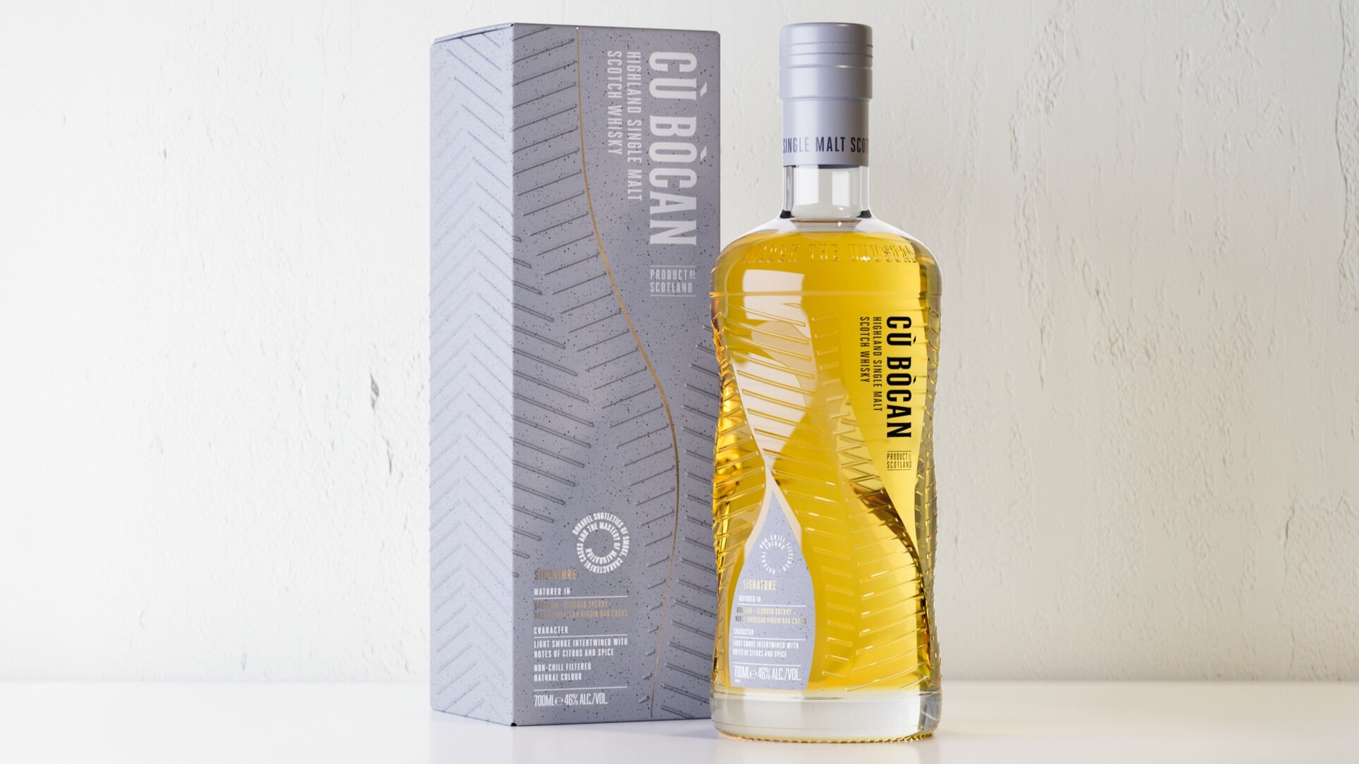
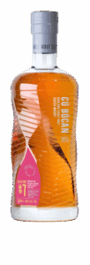
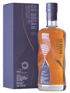
Since our re-brand back in 2019, feedback on design and branding has been overwhelmingly positive. Not long after launch we were awarded Silver at the Harpers Design Awards, and soon after we picked up another Silver award from the World Brand Design Society Awards. However after some time in market, and listening closely to our partners and customers we’ve now made some very subtle design changes to our flagship product – Cù Bòcan Signature, which you may notice next time you pick up a bottle!
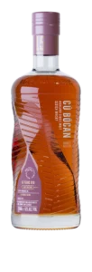
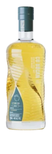
Each product going forward will have the name of the expression i.e. Signature, Creation #3 or Creation #4. The colour gradient on the Signature label is slightly darker to enhance text stand out. This will also be considered for future releases, the colour of the carton and labels will offer contrast to the text. Our whisky has always been non-chill filtered and natural in colour but now “Non-Chill Filtered and Natural Colour” will feature on both carton, and roundel on the label. We feel these small changes contribute to our overall aims of transparency and accessibility. Do let us know what you think!
Cù Bòcan Signature has been matured in Bourbon, Oloroso Sherry + North American Virgin Oak Casks. In the whisky that made our name, light smoke intertwines with rich citrus and exotic spices. Subtly smoky, surprisingly sweet, it opens up the world of lightly peated whisky.
